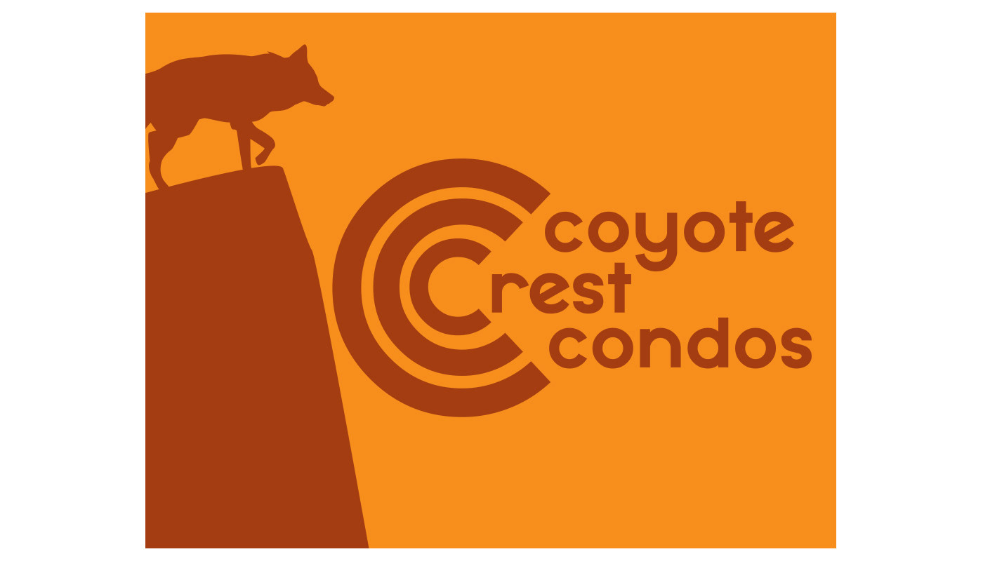
For this design I tried to shoot for a strong, yet simple presence. The color scheme I ran with is a holdover from an earlier iteration that I happened to prefer in the end. The orange and the brown are intended to give a warm presence, the brown in particular was meant to contrast with the orange to make the coyote and crest appear as shadows. The coyote was placed and aligned where it was to give the impression of it looking down onto the logo. Speaking of, I used the font "Mayeka" for its round, simple, inviting, and easily manipulable appearance. Because the business contains an alliterative name, I repeated the three C's within each other to emphasize it in a sense.