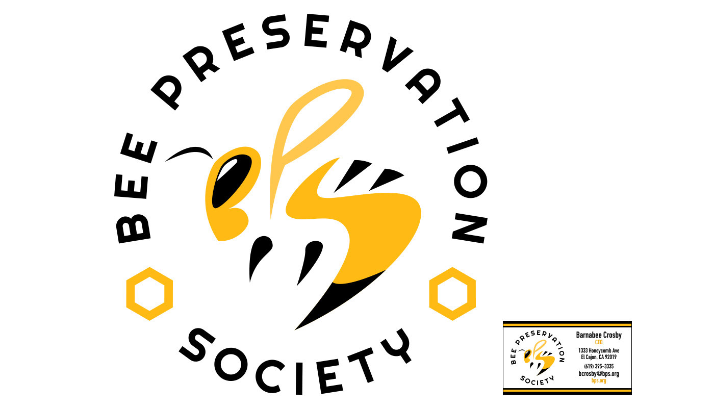
For my design, I focused on trying to make a clever icon that really integrated the business identity into it. I simplified elements of a bee to bring out the initials of the business, and left in a few key bee elements to help imply its shape more. I intentionally left the color scheme as minimal as possible, so that the bright yellow of the bee would stand out and contrast again the black. I used a round typeface to try and unite the sense of roundness that came with how the bee was specifically shaped. On the business card, I used the black and yellow borders to try and fill out the negative space so it wouldn’t come out too plain. I aligned the logo and the information side by side so that they wouldn’t overshadow each other too much. I tried to keep the hierarchy of information in mind, and so I emphasized both the person’s name and email address while keeping the main website and his title smaller. However, since they’re still important, I colored it a darker yellow so that it would still stand out and contrast against the predominantly black text.