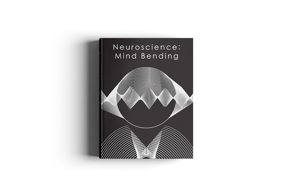
Mockup Template: https://www.behance.net/gallery/35449845/Free-Book-Mockup-Psd-Smart-Object
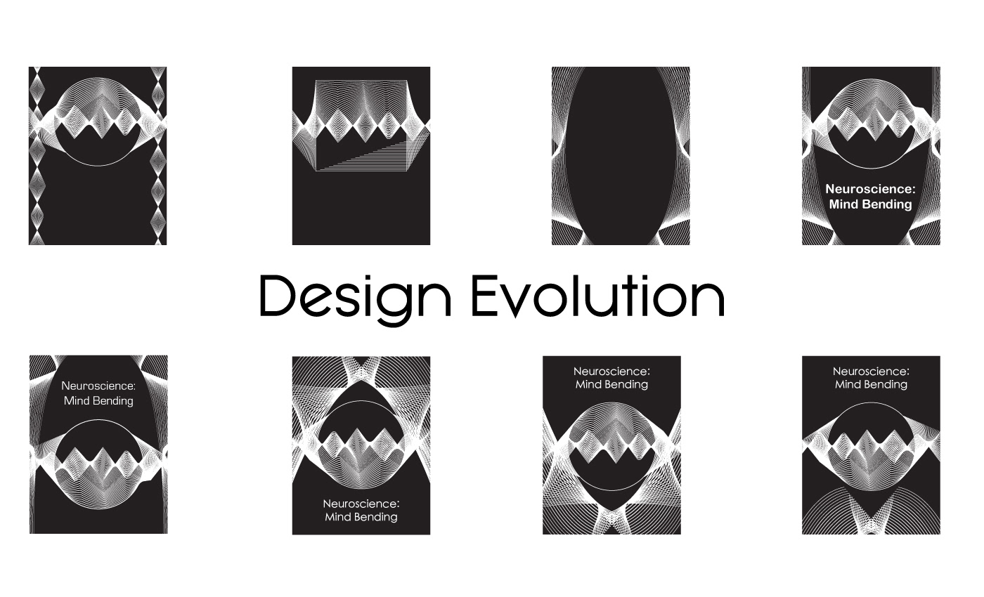
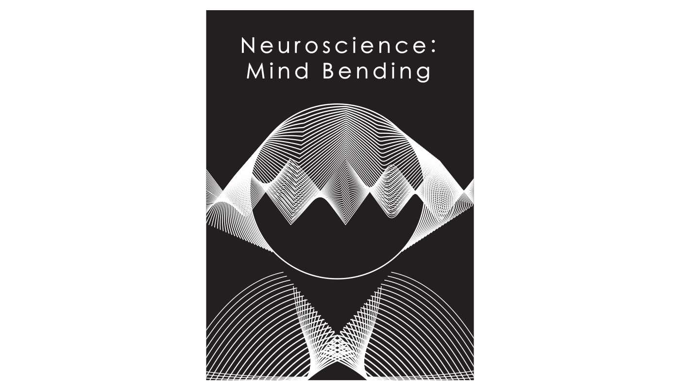
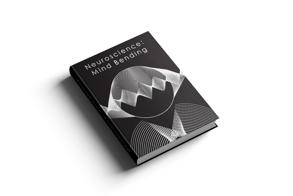
This design was based mostly on the contrast that surrounded the focal circle. It created an interesting amount of negative space that I tried to complement using the arching lines below it. They were initially going to contrast the sharper, erratic waves in the circle, and lead the eye back towards the title. The arched lines were originally much longer, but their new placement was specifically intended to give the illusion of a person. The title's font arose from a need to contrast against the loud impression the focal circle has. A thin font felt like the best choice since it stands out against the bulk. I kerned the title wider simply because the top felt disproportionately empty. It’s not a decision to arbitrarily fill space, it just helps round it out and feel whole in my opinion.