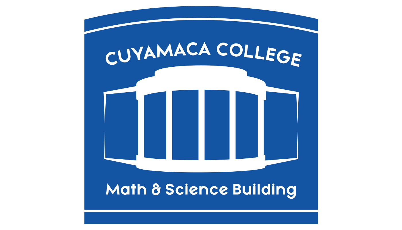
My design was based on the big center arch and columns of our school's Math and Science wing. It’s not exactly a 1:1 recreation, since I squished the original shape to emphasize how round it is. It felt just a bit empty using only the colosseum-resembling shape, so I tried to use line to imply the rest of the building. It was meant to fill out the negative space some more, give it a further sense of depth, and to contrast against the overall round shapes with sharp edges. Since the building does fill out along both sides, I repeated the same shape across. The extra lines above and below were also intended to fill out the negative space and close it in, so it wouldn’t feel so open and empty. The type is center-aligned, but I specifically placed “CUYAMACA COLLEGE” on a curved path because the upper half of the design feels rounder in comparison to the flatter lower half. The font I used is "Mayeka", used again for its pleasant and personable round shape.