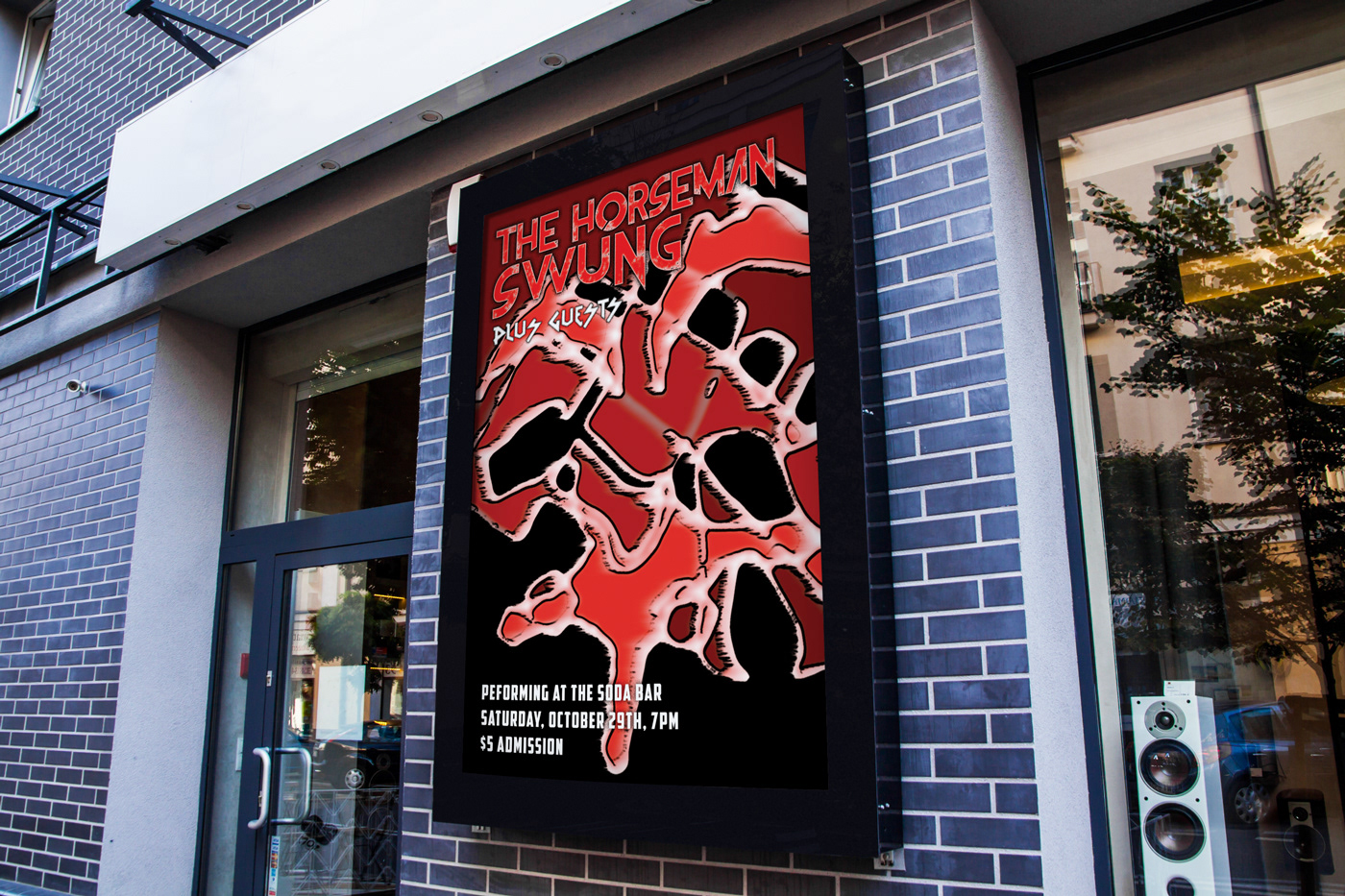
Mockup Template: https://www.behance.net/gallery/36856461/Free-Outdoor-Advertising-Screen-Mock-Up-2
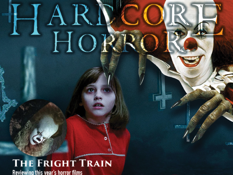
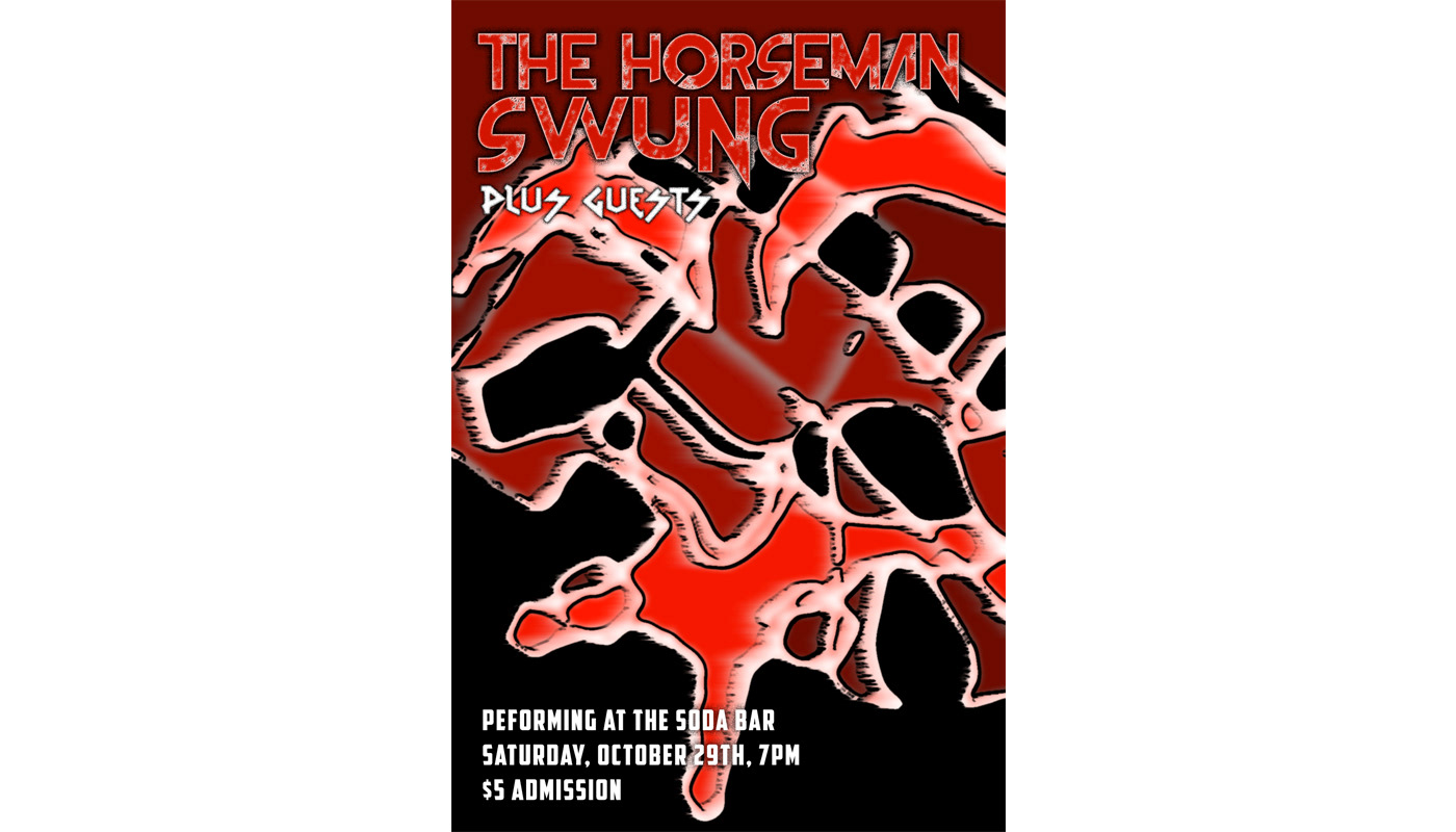
For this design I wanted to spin a Halloween type of color scheme using shades of red. I was worried there wouldn’t be enough noticeable contrast, but the filters I used wound up pronouncing their differences more. I wanted the viewer to move their eye from top to bottom, and I tried to accomplish this by putting a strong amount of focus on the top half color-wise, and leaving it relatively emptier on the bottom. I tried adding to this focus by evoking the image of a face to force the eye to move down. For my text, I tried finding the most thematically appropriate font out of the bunch. I downloaded some personal use only fonts- Shady Lane (for the event info), vtks Rude Metal (for “Plus Guests”), and The Frontman (for “The Horseman Swung”). I aligned them all left so that they wouldn’t interfere with the center aligned design of the background.