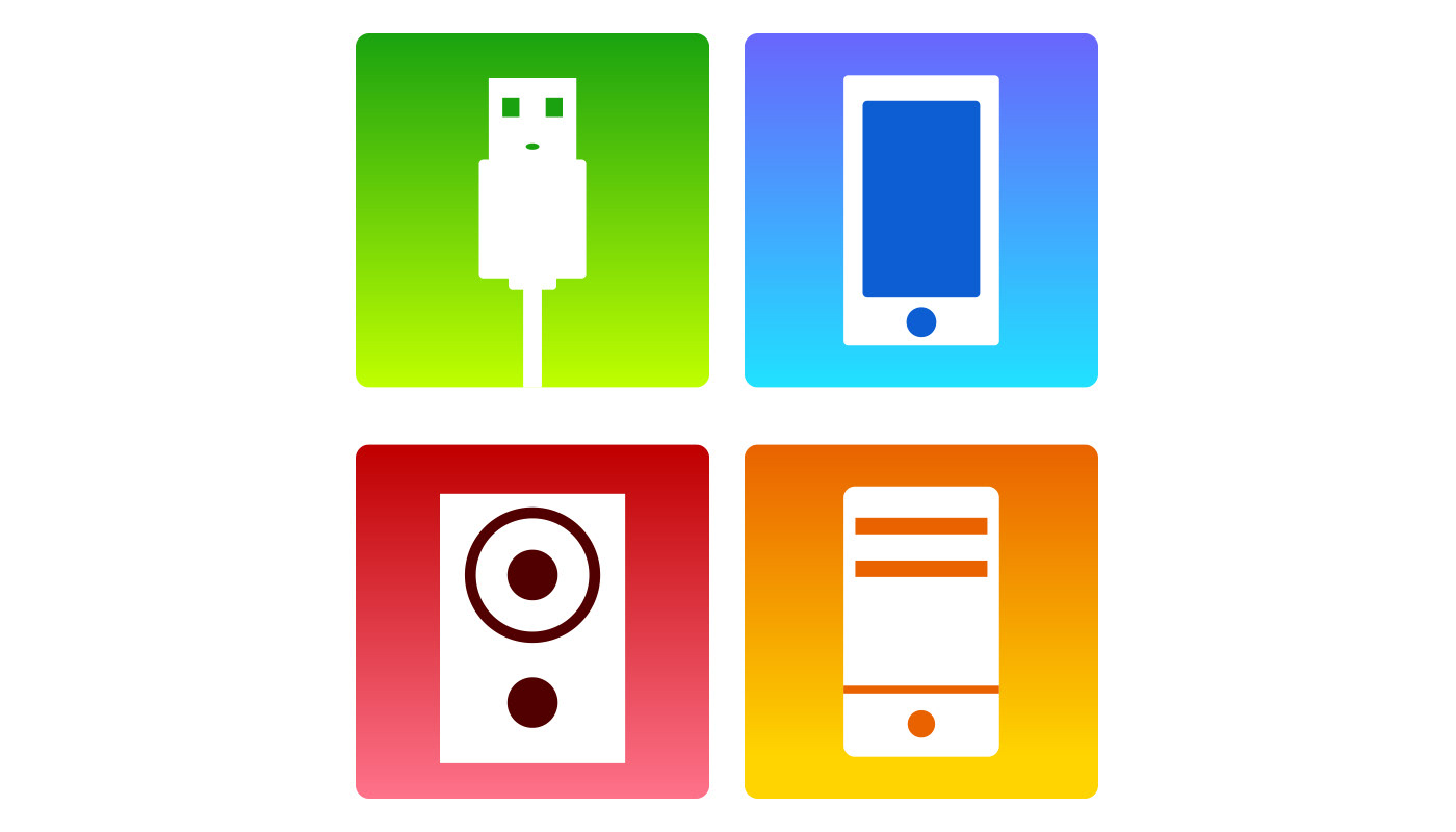
For this design, I chose to base it off an electronics store. From left to right, it’s a USB cord, a phone, a speaker, and a computer. I chose these specific items to use as pictographs because they all share a common rectangle shape. It also helped that they had relatively simple characteristics, so it was easier to keep their designs just as simple. I tried squeezing in a repeating theme of “circle towards the bottom”, since it naturally showed up on the phone and speaker, but it was a bit too hard to make it work on the USB. Still, the shapes I chose to build their designs around was intended to bring a sense of unity into it. Finally, for color, I wanted to choose contrasting colors that made the shapes pop. I chose the primary colors for simplicity’s sake, and made shades out of them to use as the gradients and “lines” within the white blocks.